
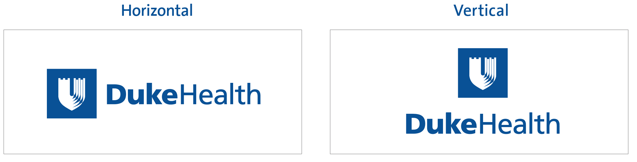
The Duke Health logo is the visual foundation of the Duke Health brand. The logo consists of the shield, within a box, with the words Duke Health. The iconic shield is our recognizable symbol for Duke Health.
- The Duke Health logo exits in horizontal and vertical orientations.
- Using logo artwork for all communications and across all marketing mediums reinforces our brand.
Duke Health Logo - Do's and Don'ts
Duke Health uses a master logo to consistently and notably represent our organization.
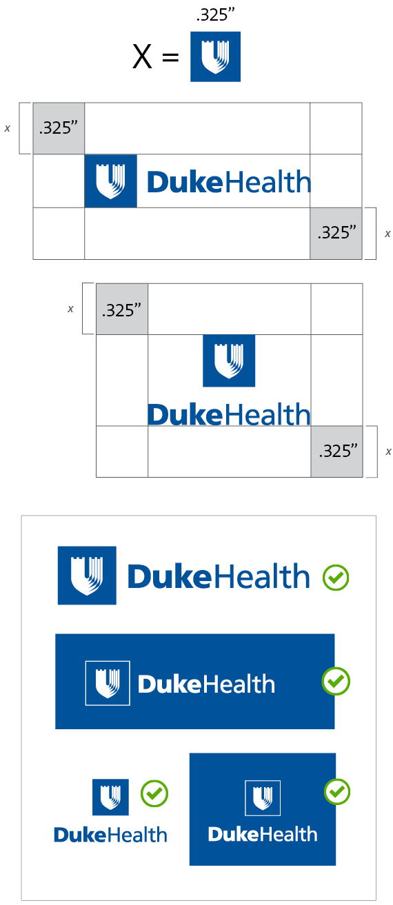
APPROVED Duke Health Logo Usage
Logo Spacing
- Use clearspace around the logo to ensure strong brand identity.
- Use the shield to easily determine the amount of clear space.
- Use the clearspace guidelines for all Duke logos.
- Use at least the clearspace required or more.
- Use 0.325” guide for the size of shield for minimum logo size.
Logo Approved Versions
- Use the Duke Royal Blue or reversed version of logo.
- Use horizontal version where possible.
- Use keyline version of reversed logo to keep the integrity of the shield.
- The shield within a box is part of the Duke Health logo.
- The shield should always be white.
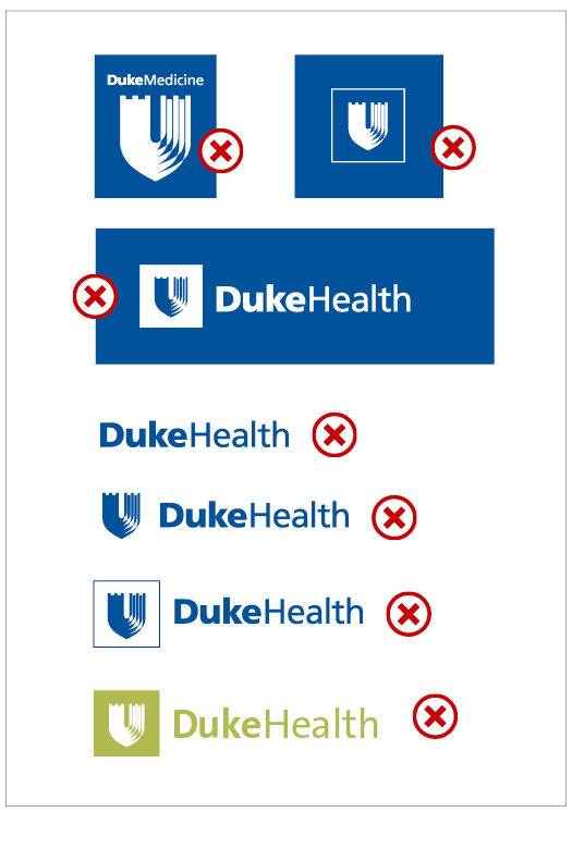
NOT APPROVED Duke Health Logo Usage
- Do not create your own logo.
- Do not use shield in the box without Duke Health type.
- Do not use the reversed box logo with blue shield.
- Logo type must always include the shield within the box.
- Do not alter the colors of the logo.
- Do not include more than one entity logo on a marketing piece.


