Duke Health

Skip to main content

Signage

All signage designs and applications must be vetted through both Duke Health Marketing & Communications as well as approved vendors before any signage or wayfinding materials can be installed.

Materials specifics like panel gauge, extrusion materials, fasteners, finishes, mounting methods and accessories are all predefined by Duke Health’s signage and architectural vendor.

Types of signs

  • Building identification
  • Site identification
  • Directional identification
  • Entry identification
  • Exterior wayfinding
  • Interior wayfinding
  • Site branding
  • Miscellaneous informational signs

More detailed signage information

Signage information

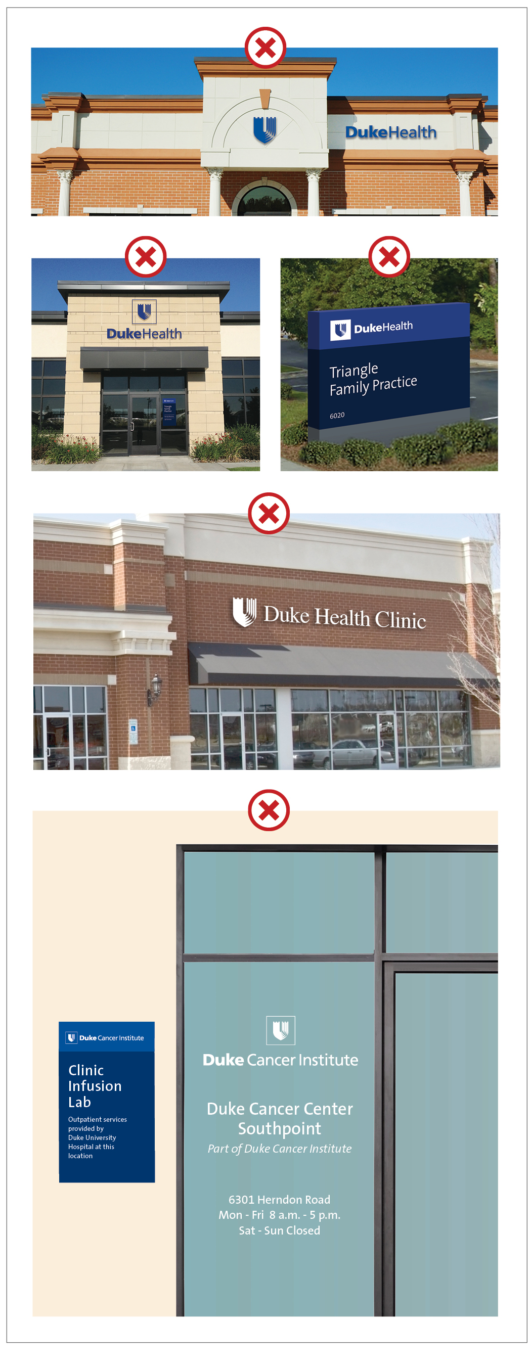
The primary entrance to every Duke Health location should be identified with a Duke Health signature logo, either in the horizontal or vertical format. If the horizontal version is used, it should be aligned left or right, not centered.

The lead exterior building identifier should always be either the master Duke Health logo or the specific hospital logo. 

Building identifiers within the Duke Health signage system are different based on whether or not the building is on or off of a Duke Health campus. Buildings on campus must be identified with secondary logos for the specific entity being represented. Buildings off campus must be either identified with a primary Duke Health logo or with the primary logo for the specific hospital entity.

If an outpatient department is paired with a Duke Health facility, the outpatient department must be clearly identified.

Ground mounted signage

There are two approved styles of signage for ground mounted site identification - vertical monolith and horizontal monolith.

Ground signs


The vertical monolith is to be used when ground space is limited. It can also be used when higher site lines are not impeded.

The horizontal monolith is to be used when a lower site-line is desired, for instance, in a busy parking area or a roadside setting with low hanging tree foliage.

Directional identification

Directional identification signage should provide specific information as to the location of facilities, entrances, departments, centers, loading docks, parking areas, etc.

Facility directional signs should help employees, visitors and patients in finding a specific destination. The list of locations should be left aligned, with directional areas to the left of the locations.

Listing of medical services on the signs is reserved for entrance identification signage only.

Secondary vehicular and pedestrian directional identification monolith signs

Vehicular and pedestrian directional signs should adhere to their larger counterparts in both appearance and construction style.

Vehicle signs


Outdoor signs


Entrance identification

Duke Health entrance identification signs are designed to let a potential visitor know what the entity represented at this specific site is, and what services are provided there.

When a single building houses multiple services, they are to be identified on the entrance signage in a vertical list, at all points of access. The vertical dimension of the entrance sign can be increased or decreased based on the number of services listed. 

These services should be listed vertically, separated by horizontal lines.

Entrance signs


Wayfinding

Duke Health exterior wayfinding signage should work together as a trail of breadcrumbs to assist a visitor or patient in finding their way to their intended destination.

Wayfinding signage can include maps, directories and directional signs, and should be simple and brief to avoid confusion.

Post mounted wayfinding flag signs

Post mounted directional flag signs should be located at key navigational traffic points on campus. The Duke Health shield, not an entity logo, should be used on these signs.

Wayfinding