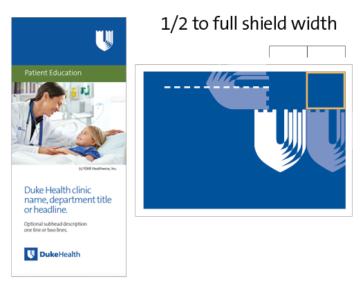
App Creation

Duke Health has specific brand guidelines to support app features and needs.

Icons

The app icon is the first visual element that people will see regarding your app. Your icon should immediately convey your app’s purpose in the simplest way possible. Complex icon designs should be avoided, as they can be difficult to distinguish on smaller devices. Neither photography nor text should be used within the app icon.

Do not use the Duke Health shield for your icon, as that will make it hard for users to differentiate between various Duke Health apps. But, it’s important to show that various apps are connected to Duke Health, so some branded element is needed.

Icon development for all Duke Health apps should follow the standard template below, utilizing the matrix as the background, and a single element – that most clearly represents the basis of your app – in the foreground.

Download the icon template.

Incorrect icon examples

Mobile apps

When developing icons for your app, consideration should be given to the specific function of the app. Your icon should align as closely as possible with the intended use and user, and use universal imagery. For example, as shown below, a Duke Heart Center app for consumers might use a heart as the single element on the matrix background. A Duke Heart Center app for physicians might use a heart with a stethoscope as the single element. 

Icons


Launch/home screen

Home screen

The home screen is the main place to brand the app and display logos. Download the home screen template here

Logo usage

Creating an identity for your app and connecting it to the Duke Health Brand are both important. Branding the app through Duke Health logo usage should be limited to the launch/home screen of your app using the template above.

The Duke Health logo should be utilized in most cases, unless there is a more appropriate existing, subordinate logo, for example, Duke Heart Center or Duke Cancer Institute. New logos should not be created for apps.

Logos should not be more prominent than or precede the title of your app, the shield cannot be combined with your app title or used to create a logo for your app, and branding should not be applied throughout the app screens or as part of the main navigation. Be sure that the logo is displayed in its native aspect ratio in order to avoid a distorted image. 

Incorrect logo usage examples

icons


Naming

When naming your app, think about the specific function of the app and the intended user. Select a simple name that most accurately describes the use of the app.

Review Apple's guidelines on naming, and refer to section 2.3.

Review Google's guidelines on naming.

Make sure you test your app name across all platforms to ensure that the name doesn't get truncated by a character limit. In general, the display name for your app, which appears under the app icon, should be limited to 11 characters, including spaces. The full app name, displayed in the app store, can be longer – 23 characters, including spaces. 

Description

Your app description should describe your app accurately and highlight the features and functionality of your app. The first two sentences of your description are generally what can be read without tapping for more content, so put your most important content first. Make sure to use simple, easy to read and scan content to convey your message. Consider keeping your description to a few sentences with a brief list of key features. An eighth/ninth grade reading level is recommended.

Test if your app has an acceptable readability level.

Keywords

To ensure potential users can easily find your app, select keywords that most accurately identify your app. Consider the specific words people looking for your app might search, and enter those terms as your keywords. You only have 100 characters, so select the most relevant keywords for your app. Keywords should be separated by commas, with no spaces between them. If Duke is part of your app name, you do not need to repeat it in the keywords. 

Typography

If the operating system (OS) you are using has a default system font, you may use that font to ensure the app feels at home on the OS. Otherwise, Open Sans has been chosen as Duke Health’s font family for digital applications and may be utilized for all apps if the system allows it. Download Open Sans.

To ensure readability on apps, use font sizes between 12 and 14 points.

Accessibility and usability

In order for all intended users to be able to use and enjoy your app’s functions, refer to the platforms’ guidelines on accessibility and usability below. 

Review Apple's recommendations on app accessibility and usability.

Review Google's recommendations for app accessibility and usability.

Apple ResearchKit

ResearchKit apps should follow Apple's guidelines.

ResearchKit icons should follow the template, as shown below. Download the template here.

icons